

In doing my edits and reviews of images lately I occasionally come across some subjects that just don’t seem complete. Images where some post processing is necessary to capture the original feature that attracted me the most. In particular with this geranium, what drew me to this particular flower was that it was saturated in raindrops from a storm that passed through overnight and that it had some fairly isolated features (the buds, the leaf, and a good background).
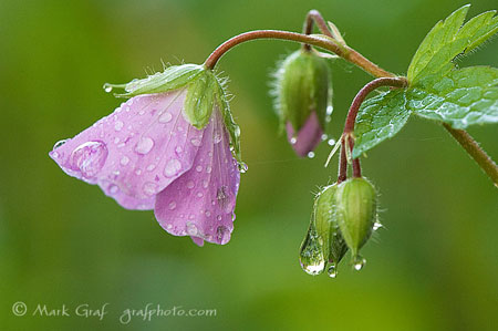
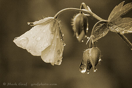
So after I prepared this image to be uploaded to the site, something was still not finished about it. It many ways, the ‘as shot’ image wasn’t communicating what interested me to begin with. Other elements were competing – mostly the color. So I went back and worked with it a bit more, and decided this toned image just fit the subject matter better, fit the raindrops better. The details tend to stand out a bit more, without having to compete for attention with the colors.


I love them both! 🙂
(and thanks so much for the spam karma link- it’s working well- too much spam, not enough time)
Your images are always a treat to view.
I agree that the detail is better represented in the duotone image. However, the colours in the original are truly beautiful.
Both of these images are beautiful, but I am a sucker for a sepia toned photo! Quite lovely work.