


Pantone® announced their Color of the Year for 2022 yesterday, Very Peri. As Pantone always eloquently describes their picks, Very Peri is intended to be “a carefree confidence and a daring curiosity that animates our creative spirit” as well as “a symbol of the global zeitgeist of the moment and the transition we are going through.” It is also the first time in the 23-year history of Color of the Year that Pantone created a brand new color specifically for this annual celebration of color.
What is very Peri?
All of the previous year’s picks have relied on selecting a color within the Pantone catalog that matched what their team felt aligned with the global themes of the year. But for 2022, with what Laurie Pressman, VP of the Pantone Color Institute, described in a webinar this morning, the world has been experiencing “massive global change” with a lot of uncertainty that lies ahead. The fact we have emerged “shaken” is also a time for excitement. And those themes called for an emphasis on pure curiosity and a playful aesthetic to help get us through these challenging and changing times.
Some of the other keywords that went into their design of this color are reported to be: courageous, empowering, spritely, joyous, dynamic novel, presence, imaginative, whimsical aesthetic, and futuristic. If these words do indeed come to define 2022, I’d consider that a positive.
New, but familiar and different

Traditional Periwinkle may be a color of familiarity for those that enjoyed the Crayola crayon by the name or anyone walking in the woods and seeing the creeping vine of Vinca Minor. The name is also associated with a type of sea snail Littorina littorea but no associated color. I think Very Peri is fairly close to previous year’s picks of 2018’s Ultra Violet and 2008’s Blue Iris – but it doesn’t take much to shift a color into a completely different feel.
The color for 2022 brings a bit more excitement of red to the party. As an English word, it is kind of fun to say, perhaps further emphasizing the symbolism of creative spirit and embracing childhood memories of crayons or even playing with snails on the beach.
RGB and Hex Values for Very Peri
In a somewhat annoying move, Pantone moved the technical color data values for their colors of the year to their Pantone Connect app instead of what used to be conveniently available on their website. So you can find those values below and the swatch I made above:
| sRGB | 102 103 171 |
| HSL | 239 40 67 |
| HEX | #6667AB |
| LAB | 45.75, 12.21, -36.75 |
Very Peri in nature

As I typically do just as a fun way to explore my photo archive, I look for photographs that match or at least come very close to the Color of the Year. Some years are more difficult than others, but in the case of 2022, I think this color has a lot of close representation in nature beyond just the specific flowering vine (which I know I’ve photographed but can’t find it!).
It also happens to be one of my favorite hues a landscape can take on with early morning transitions between astronomical and nautical twilight and brings to mind an illustration I created back in 2006. Winter landscapes can also have this mixture of blue and red tones right up to the sunrise. If I were King, I think the “periwinkle twilight” phase deserves a place in our nomenclature because of the soft, comforting color it blankets across the landscape. (perhaps only familiar to those willing to get out early enough to witness it)
And speaking of being King, if I were King of Adobe, I would incorporate a color search tool into Lightroom. A nice visual interface with a color wheel where you could circle a band of colors, and the software provides a search result of all the images containing those colors. Wouldn’t that be cool? Until then, it is old-school, opposite of AI, keyword searching with my simpleton reference of “purple” or “violet”. 🙂
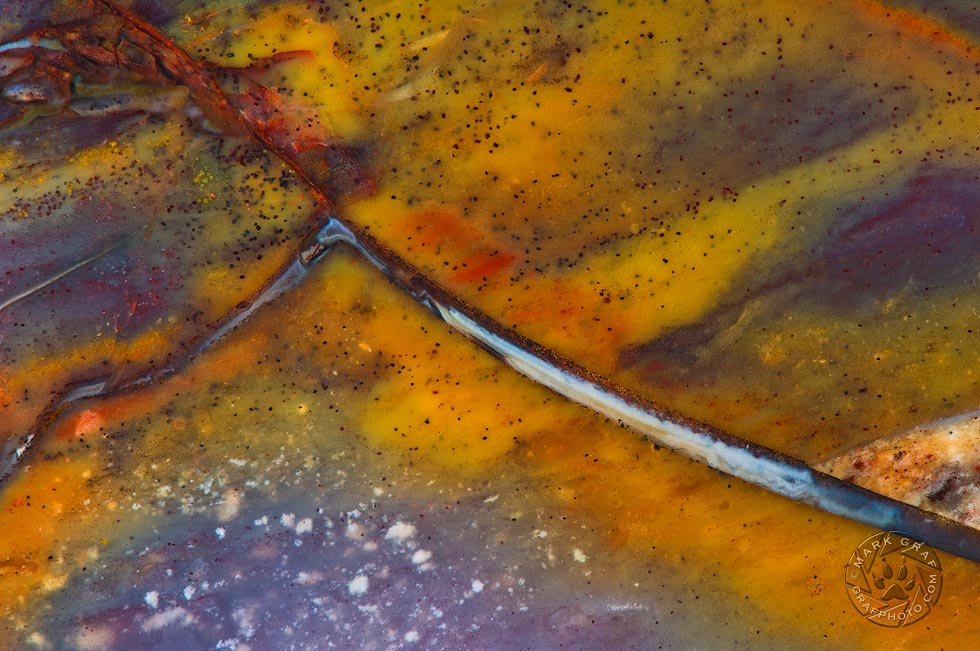
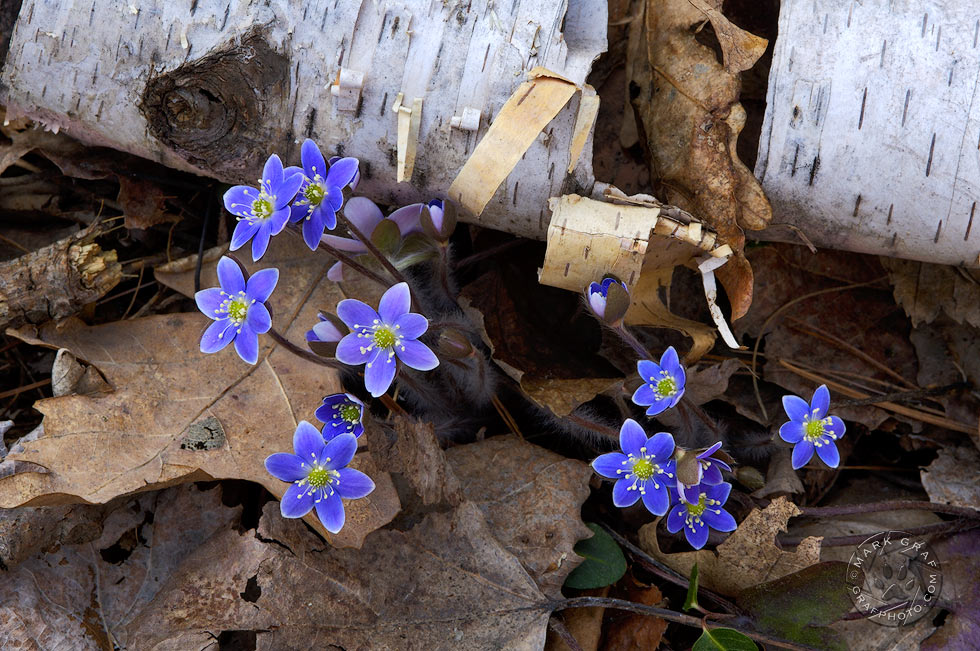
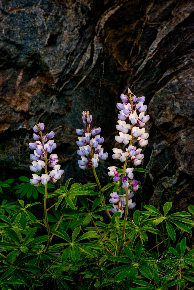
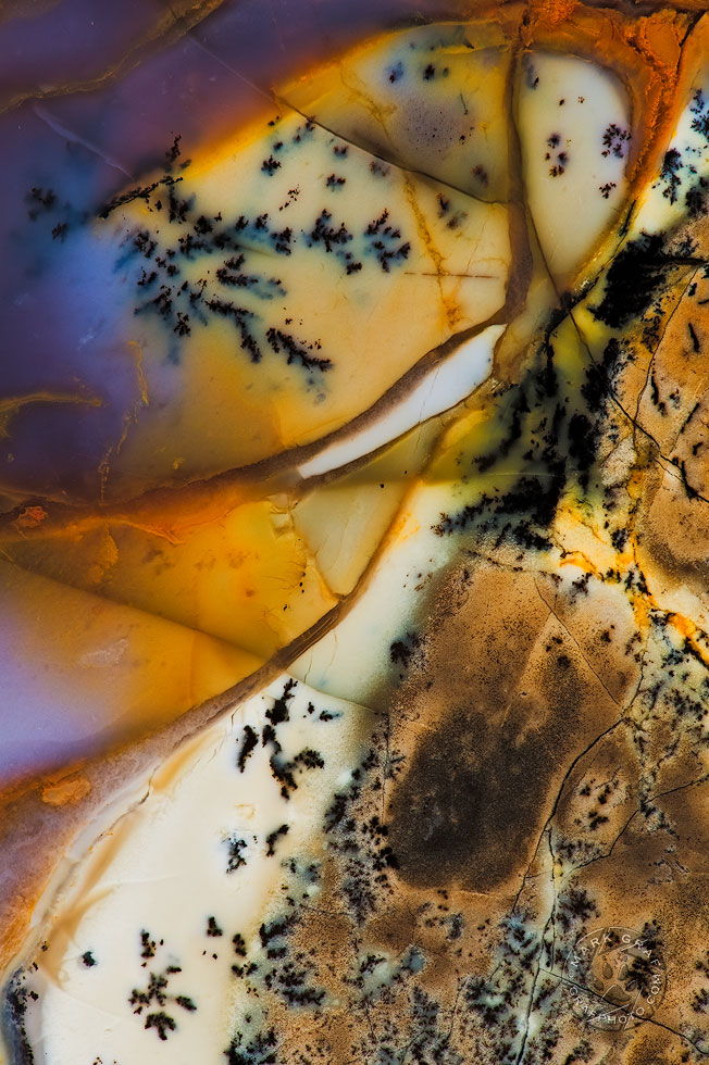
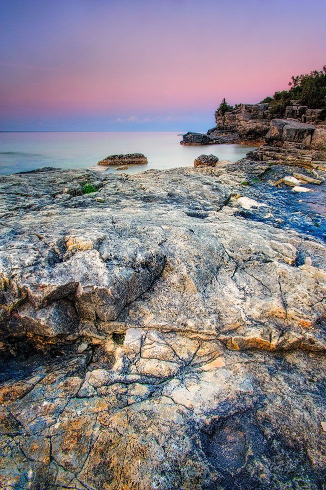
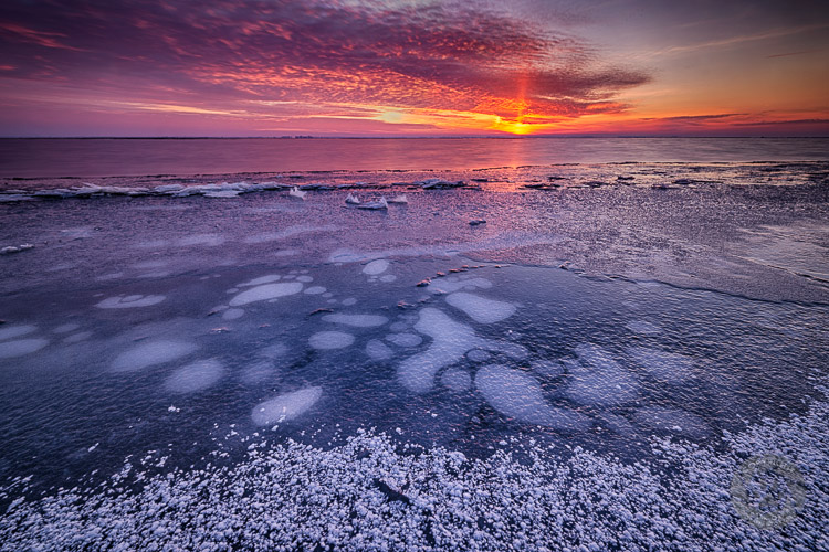
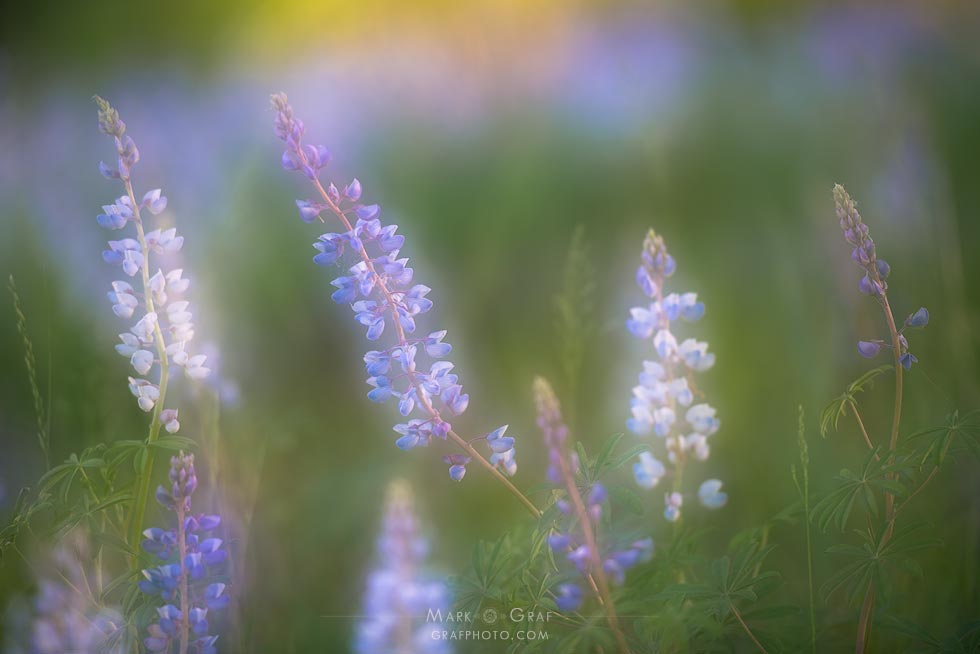
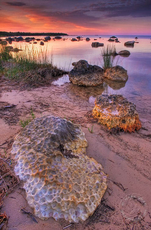

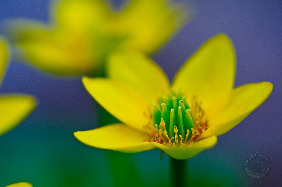
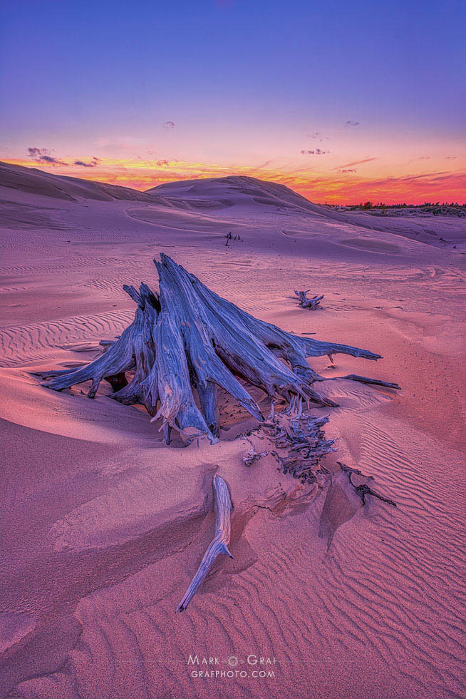
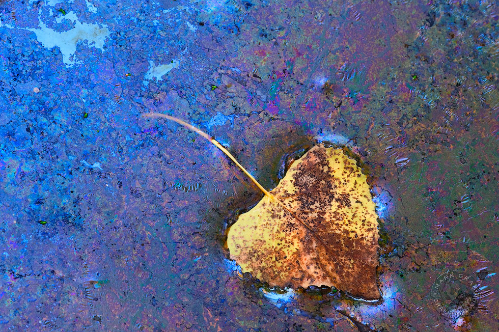
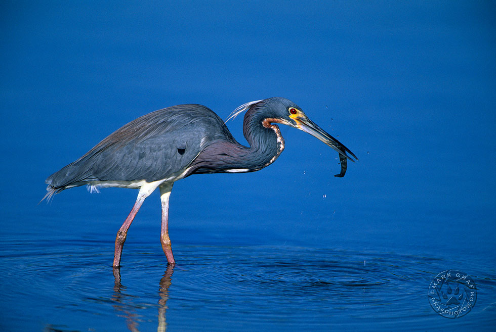
This is certainly a color I’ll play with more in the coming year, perhaps exploring color grading aspects in using it as it does favor natural-looking scenes. Should you make a post about your own collection of Very Peri, feel free to link to this post and I’ll approve the trackback that will appear in the comments below.
(note: only if you have your WordPress Settings>Discussion>Allow Link notifications… checked, otherwise I can add them below)
Other wonderful Very Peri example collections worth exploring
- Alex Kunz : These Flowers are Very Peri
- Blue Brightly: COLOR IMMERSION: Pantone’s Color of the Year for 2022
- Linda Grashoff: November Tour of My Neighborhood, December Tour of My Archives


Fine article and beautiful photographs. I’ve admired the blue-red colors in your winter lakeside photographs for years – recently I finally experienced those colors at dawn in Maine. Almost make me want to get up earlier. Almost.
They can make it worthwhile sometimes but often can fizzle out just as spectacularly. I’d like to see Maine this time of year to compare. Thank you for your comments Tom.
So happy to see your inclusion of a Leptothrix discophora film (Leaf in the Cosmos) in your very nice Very Peri collection! Interesting post. You inspired me to seek out what I hoped was one of my own Very Peri photographs. It’s not quite there, but close. Was fun to see Alex’s take on the color—good that you inspired him, too.
As you know more than most, there aren’t many colors that aren’t represented by Leptoyhrix! 🙂
Mark, I love your idea of a color search tool for LR. And how did you search? Do you tag with color names or did you scroll through and look for Very Peri? This is really a fun post – I even clicked back to see the comparable colors, both of which I find attractive. The Vinca minor description appealed to me because I know that plant and admire the flower color. Your opening ice landscape brings a lot more life to Veri Peri than the standard Pantone swatch. I love those little Hepaticas, too. Finally, I agree that it would be great if the words Pantone used for their color of the year do come to be relevant to this year but sadly, I’m skeptical. Oh well, we can always hope, but for that, I think we need something in the yellow family….
Thanks for comments Lynn. I typically will keyword photos with the predominant color(s). On more than one occasion I’ve had requests for certain colors to compliment certain interiors, so I started doing this to make it a little easier on myself. However, as I mentioned in the post, my color keywords are rather primitive compared to the sophistication of the Pantone catalog, which is why a search tool would make it a heck of a lot more thorough. I have to try to keep my cynicism in check with regards to this whole COTY thing. I realize it is mostly a marketing thing, but they do communicate some good messages.
I hear you about needing to remain open yet keep a little bit of skepticism re the corporate messaging. I’m almost ready to post a compilation of images – all flowers, naturally, that express the COTY. It’s been fun and I wouldn’t have done it if you hadn’t posted this. Thank you. At this time of year, immersing myself in color is therapeutic.
Ah, that time of year again! Always fun to hear your take on the Pantone Color of the Year (? PCOTY) Your photos are Veri Peri indeed. Really great shots!
Thanks and have a very peri day! 🙂