

The wait is over… amongst all the turmoil and uncertainty this year, I know you all have been anxiously waiting for Pantone to reveal their pick for 2021. What could it be? Vaccine Violet? Facts Fuchsia? Maybe Parisian Night to symbolize our rejoining of the Paris Climate Accord? Despite my history in following the Color of the Year, sadly I was not consulted to voice any input into 2021’s selection. That’s probably for the best.

Pantone decided to go with two colors for 2021. Vanessa Friedman writes in the New York Times about the reasons contributing to the selection of these two colors. Basically they represent the concepts of stability (if not the grey cloud hanging over 2020) plus illuminating hope.
This is the second time in the COTY’s 22-year history that two colors were picked. The first duo made their debut in 2016, but this is the first time a gray was selected. The article mentions “very high stakes” in picking something for 2021 which lends itself to sounding just a wee bit pretentious, not that anyone doesn’t crave a bit of stability and hope after the hell of 2020.
Nonetheless, I take it as a self-challenge to find images that may have some significant representation of the color of the year. Other than pure marketing buzz, I have found ZERO commercial applications for such images. It is just a fun thing to do. At a minimum, it is an opportunity to peruse one’s own archive to revisit forgotten images. However, with this rather odd, err “supportive”, color combination – it is especially difficult. Finding yellow in nature is a no brainer. Finding gray is not too hard either – especially if you expand it to the tones in B&W photos. Finding them together, a bigger challenge. But I managed to find a few and nudged some into compliance.
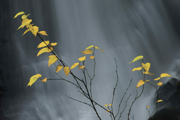
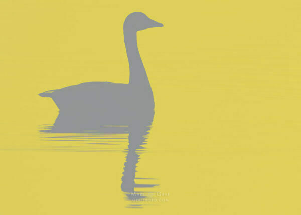
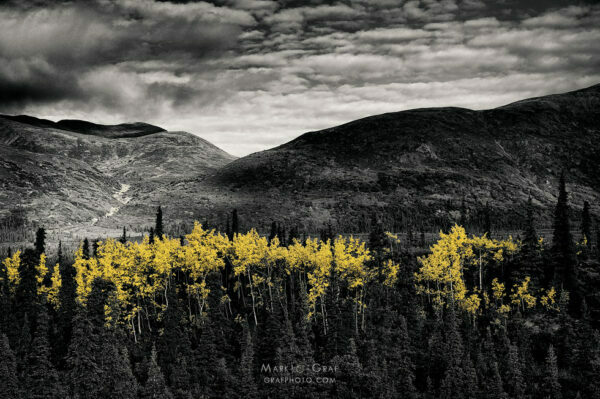
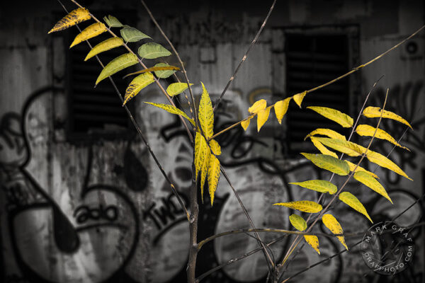
Of course, solid color paint chips don’t represent the tonal variations in nature. I think the yellows in these photographs are close enough. I already had a couple of images where I used selective color to emphasize certain aspects vs. a monochrome backdrop. The goose, well, I simply took an existing silhouette and converted it using a little Photoshop wizardry using two colors for 2021.
Illuminating Yellow and Ultimate Gray in a Gradient Map
Ok, confession – I am no wizard, just familiar with the possibilities using the Gradient Map adjustment layer. This tool allows you to pick a couple of colors (or more if you like) and map them across the tonal range of your photo. Pantone provides the color swatches for download here. A yellow and gray aren’t exactly obvious as a color combination, so I started playing a little. The results started taking on an “art-deco” graphic style like Andy Warhol might conjure up.
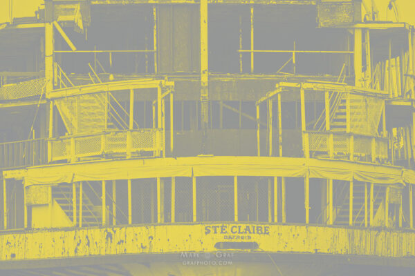

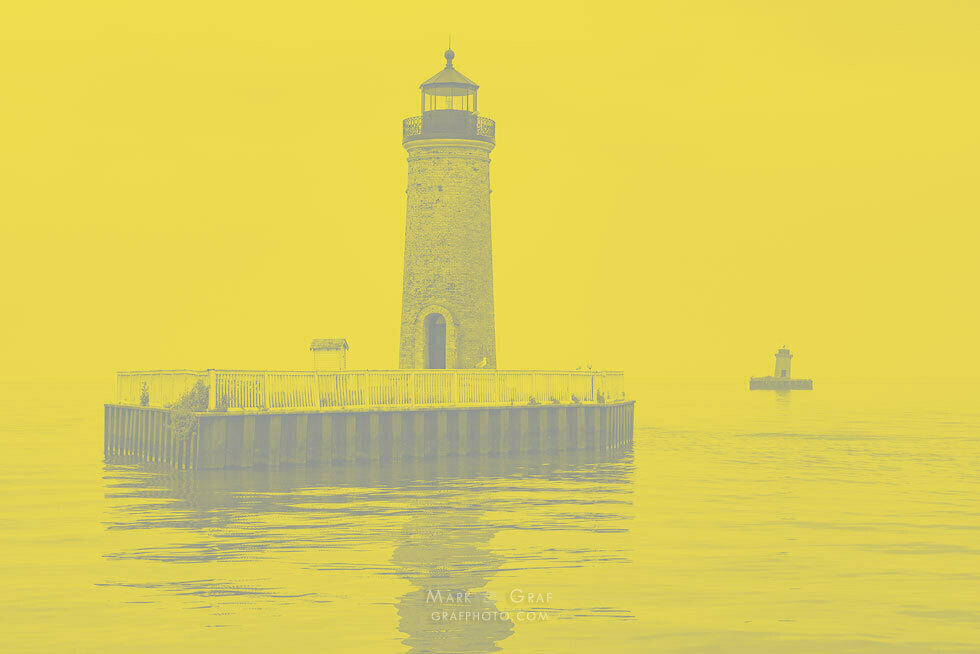
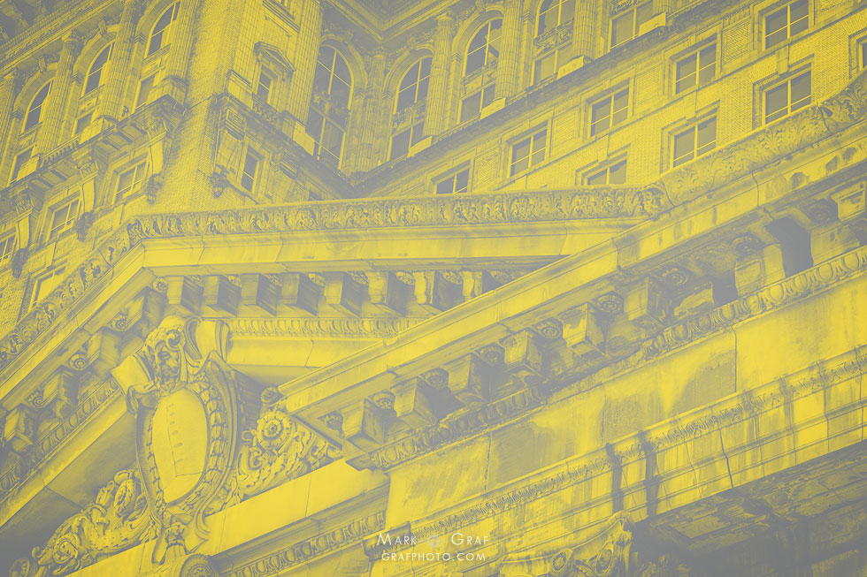
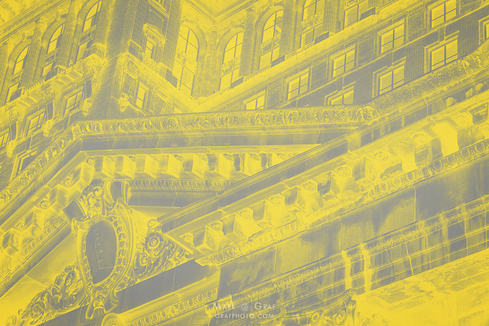
The “odd couple” of colors?
My initial reaction to this color combination was a bit mixed. But as I play with these graphical interpretations, I have to admit there is something quite interesting about this selection. It has quite a unique and authentic aesthetic that is starting to grow on me. Will the combination become a fad for 2021, drawing those that are craving symbolism of hope and stability? I suppose that is a question best left to the color wizards, fashionistas, and psychologists.


Haha! That was a fun read, I really appreciate your humor. 🙂 Also, an interesting exercise, going into your archives to find images that contain this color combination. Grey and yellow. Shudder! ?
Go for it in your own collection 🙂
Well, you’ve certainly done justice to the yellow and gray combo!!!
It was fun to play with – thanks Howard