

Well, at one time I thought I had a self-imposed “tradition” of capturing some thoughts about Pantone’s Color Of The Year and seeking photos to match it. I knew I took some time away from it, but it seems I have REALLY took some time away. The last color I wrote about was 2014’s Radiant Orchid! Ahhh Radiant Orchid, you were fun while it lasted so long, long ago. Being a diver and ocean life advocate, Pantone’s pick for 2019 sparked my curiosity a bit.
2019 Color of the Year: Living Coral
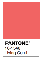
Pantone Color of the Year for 2019 is “Living Coral” HTML#FF6F61
Pantone’s pick for next year is “Living Coral.” And, with the vibrant and expected Pantone flourish of language and color intelligence, they describe it as:
“In reaction to the onslaught of digital technology and social media increasingly embedding into daily life, we are seeking authentic and immersive experiences that enable connection and intimacy. Sociable and spirited, the engaging nature of PANTONE 16-1546 Living Coral welcomes and encourages lighthearted activity. Symbolizing our innate need for optimism and joyful pursuits, PANTONE 16-1546 Living Coral embodies our desire for playful expression.”
and further expand on it’s natural elements similar to the previous 2 years :
“PANTONE 16-1546 Living Coral emits the desired, familiar, and energizing aspects of color found in nature. In its glorious, yet unfortunately more elusive, display beneath the sea, this vivifying and effervescent color mesmerizes the eye and mind. Lying at the center of our naturally vivid and chromatic ecosystem, PANTONE Living Coral is evocative of how coral reefs provide shelter to a diverse kaleidoscope of color.”
I have to admire Pantone’s copywriters, they do have a gift! But I let out a big sigh…
With all the publicity that surrounds these picks, it is an opportunity to remind people of just what a precarious position our coral reefs are in. I don’t see that Pantone has necessarily resisted social or environmental commentary in the past, with either obvious or subtle clues in their language. Their pick of 2017 Color Greenery came with remarks of “Greenery symbolizes the reconnection we seek with nature, one another, and a larger purpose.” And, as far back as 2009 Mimosa with “embodies hopefulness and reassurance in a climate of change.”
The very real threats to living coral

Encrusting Sponge on coral – exhibiting a close proximity to Color of the Year for 2019, Little Cayman island, Cayman Islands
Recent months marked the loss of one of the biggest defenders and scientific minds on coral reefs – Dr. Ruth Gates. Her life’s work was dedicated to help coral reefs adapt to the warming ocean temperatures and increased acidification caused by human use of fossil fuels. As the Director of Hawaii Institute of Marine Biology, she is a prominently featured scientist in the documentary “Chasing Coral.” She died this past October at the early age of 56. (NYT Obiturary)
It would be an understatement to say I was (am) inspired by her work as it is so critical to what our reefs are facing. Chapter 9 of the recently published Fourth National Climate Assessment goes into extensive detail on the immediate threats our coral reefs are facing. The IPCC report issued in October warns we have but 12 years to make drastic changes in our use of fossil fuels. It states :
” For example, multiple lines of evidence indicate that the majority of warmer water coral reefs that exist today (70-90%) will largely disappear when global warming exceeds 1.5°C (very high confidence) “
Seventy to Ninety Percent gone! As a diver I have already personally witnessed many bleaching events. Quite frankly it is absolutely heartbreaking to watch these small ocean civilizations, these “naturally vivid and chromatic ecosystems,” in decline all over the planet.
Pantone’s publicity around the color of the year seeps prominently into the fashion and interior design industries. I imagine the buzz about the color is intended to spark new purchases in sync with the latest trends. With this excitement around our coral reefs, we should remind ourselves just how much the textile industry contributes to the existential threats to living coral.
The United Nations Framework Convention on Climate Change estimates the fashion industry is responsible for 10% of current global carbon emissions, and could climb to a majority source by 2030 if sustainable practices are not implemented. Every year clothing that is barely worn is discarded and not recycled, to the amount of $500 Billion.
I recognize the Color of the Year selection is mostly in the pursuit of marketing and needs positivity. It also expresses vision of a future. As an obvious influencer of the industry, it wouldn’t hurt, and likely help, for Pantone to issue some type of recognition of this urgent global issue. Put those talented creative writers to work in crafting such a message. If the world fails to act, we will likely only have a memory of what living coral was like. The colors of 2030 may have a much darker message and hue.


Loved this blog post and love their color pick of the year. Climate change is destroying reefs worldwide and more awareness can only be a good thing. I applaud their pick.
Their write-ups remind me of the J. Peterman catalogues.
LOL! Perhaps alumni?
I agree, especially with the name of this color, a little less marketing and a little more environmental awareness would have been good. The Pantone color of the year is always fun though, and that coral is indeed lively, and gorgeous. And look how well it harmonizes with your background – those soft gray-greens – and again with similar colors in your coral photo. If only the US wasn’t so backwards when it comes to the environment….
Completely agree Lynn with all of your remarks here. It’s funny, there is a palette selection area on their site where Living Coral can be used as a focal point. All of the other colors in that palette are olives, warm grays, very similar to what I use here. I may test “Living Coral” out as a button color.
I see that! 🙂 Thanks for mentioning it. This quick immersion in the Pantone world takes me back – way back – to art school days. I had a batch of paper samples with Pantone colors that we used for color problems. I remember enjoying the richness and subtlety of those papers.
Well said. More people should read this. Too bad they lost the opportunity to talk about the thing that makes their color of the year so important.
Well, 2019 isn’t here yet, they have a chance before the story gets old! 🙂
Wow, Mark, I hadn’t realized it had been that long since you last Pantone Color of the Year post. Hey good comeback with this excellent post on the urgent survival situation of coral and the oceans themselves are facing…well written! Also a fitting and beautiful image.
Heh, yeah neither did I until I searched for when the last time I wrote about it. Time flies I guess. Thanks Earl.