


A question I often struggle with when working with abstracts is when it comes to the name. Do I label it with what it is, or what I imagined it is? Words accompanying any art can be quite suggestive. And while part of me wants the viewer to interpret what such photographs mean to them, the other part realizes without context or any recognition, a viewer may not connect at all.
“…mystery consists in affording an opportunity for the exercise of the imagination, whereas suggestion involves stimulating the imagination by direct or indirect means.”
Anderson, Paul L., 1919
I suppose the more famous success stories of labeling what it is, and at the same time having it interpreted to be much more than that is in Edward Weston’s Pepper Number 30. But in Weston’s case, I doubt there was much mystery in what it is literally. The artistic success came in what else it could be.
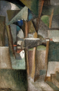
And looking to some more historical abstract artists, I find a broad range of styles when it comes to labeling the work. For example, this painting by Albert Gleizes is titled “Les arbres” (The Trees). Without knowing the title, I am not so sure I would interpret it as such, or maybe I would come around to that interpretation. But knowing the title, the baseline subject of “trees” is firmly stuck in my head. The power of suggestion.
With this post’s featured image “Martian River” – I did not have a Martian River in mind when I was photographing this small piece of Morrisonite stone. In fact, it only came to mind when developing this image 8 years after the initial exposure. During development, the color tones and the flowing lines along the bottom reminded me of a riverside landscape, somewhere else other than Earth.

I know there is no right or wrong way to label such work – you just go with whatever you feel like. For now, I admit I am inconsistent. I am not sure that matters either.
Technical note add 29Apr2020: If the painting above appears large and blurry, or the featured image at the top of the post appears similar, I am trying to diagnose what is causing this on my site. For some reason, they are being auto “scaled up” in some instances and look like crap. Just another website headache when things don’t work the way they should! Ugh! If you are encountering this issue, just let me know in your comments.


I have no answers when it comes to naming images as it’s something I struggle with on a regular basis. Perhaps the artist naming their image is like a parent naming their child…fully within their rights to do so but it comes with some responsibilities as well. I do like that an image name sometimes gives a peek into the artist’s view of their piece of art.
On this beautiful image, I think the name appropriate.
FYI: In my browser, the Du “Cubisme” image is blown-up to full column/page width and not very sharp, Mark. I was wondering why you made it so large until I read your added Technical Note. Good luck! 🙂
Well rats! I thought I fixed it last night and I guess not. The weird thing is – it displays fine if I am logged in to my site, and haphazardly if I’m not. It has happened with a couple of other images on my site. I’m at a loss on what is causing it – may have to go to tech support for my theme.
Mark, I just cleared my browser cache files, and now the image in question looks normal. I’d read your post yesterday but didn’t have a chance to comment until today. You may have fixed it last night but some browsers may still use the cached incorrect images. Hope this helps! 🙂
I appreciate the confirmation. I also cleared my server side caches in case that was it as I frequently have issues there. And I updated to WP5.4 in case there was some bug involved. I was waiting for a .1 release. So who knows between all of that what happened. Just not sure it’s gone for good.
Mark, I came back this morning and the image is showing as “supersized” again. 🙁
Thanks for checking on this again Earl. I looked at my end and saw it as well. The odd thing is, it disappears when I am logged in to WP. Looks like I am going to be debugging for a while on this one to try to figure it out.
I hope it is fixed now. I found some left-over custom CSS that may have been causing an issue – just odd it wasn’t consistent in making other posts have the same behavior. Fingers crossed.
I agree that the title can have an impact on the viewer. But as I see it, an artwork’s title, or absence thereof, is as much part of the picture as a brushstroke or in the case of a photograph, the light. As such, the title will always be right since art is never “wrong”. Our deliberations and insecurities make it seem somehow important at the time but in the end the artwork and its name become inseparable, and it’s difficult to recall why we got ourselves so worked up over it.
Abstraction in art as in photography is easily my favourite genre. Abstracts are sometimes seen as lazy art—you know, any-7-year-old-could-have-done-that type of mentality—but to me, it highlights the skill of the artist or photographer more than most genres. I find this to be especially true for photography where sometimes the beauty of the photo lies mostly in the subject matter rather than the ability of the photographer (e.g. landscape, flowers). With abstracts however, the beauty becomes a product of the photographer’s vision and skill to make it so. What is more, an abstract allows greater freedom of perception for the viewer. An abstract can trigger sentiments and emotions that will more likely be free of biases and preconceived ideas and a title merely becomes a pointer in which to direct the thoughts, not a fait accompli, as say, a perfectly executed photo of the Eiffel Tower in Paris.
Anyway, your image is a perfect example of what I am trying to say. A beautiful image that transports me to a future where the the first signs of terraforming become a reality on Mars. What’s not to like? 🙂
Yeah! Who exactly led us down this road of giving fanciful names – I want to have a serious talk with that person! 🙂 I know personally I am more drawn to abstract works because I do think they give my imagination some exercise. But I fret about leaving it too open to interpretation vs. giving some baseline direction of concept in a title. I recognize that could be just a bunch of nonsense on my part. I also like the separation from an identifiable reality in a way – perhaps the opposite of a traditional documentary photograph as you describe, free of those biases and preconceptions. Anyway, thanks for the input on this Cedric, and the kind words.
I’ve always enjoyed your wonderful Stone images Mark. I love the name got this one as well. I tend to name what I imagine they look like in much the same way you did here. But I also love hearing what others see so I also understand titles that are more open to interpretation.
Thank you Howard. It has been awhile since I have worked on any. I blew the dust off a few recently while poking around in my archives.
The naming bit is tricky, but I may also be overthinking it, which I tend to do.
P.S. Your rock photo is striking, and your title for it works.
Thanks Linda. Naming has always been an issue for me. Then if you throw in aspects or marketing and naming for search engines, it gives it another dimension of complexity!
Thank you for talking about the difficulty in titling photographs. I feel less alone. 🙂