


Viva Magenta is unveiled as the Color of the Year for 2023 by Pantone®. For me, it certainly isn’t a hue I think of when I think “magenta” – but I am influenced by the pinkish variety that is consumed voraciously by inkjet printers I’ve owned over the years than the original purple-red version. The color for 2023 is a bit in the middle. Like many previous years, the experts at Pantone see this color as rooted in nature although uses descriptive terms such as vigor, joyous, brave, and rebellious spirit. Human-centric words are perhaps more suited to the origin of the word magenta and the battle it was named after by the original French chemist than any natural origins.
That chemist, François-Emmanuel Verguin, in 1858 was experimenting with industrial chemicals, and a very toxic one at that, called aniline, a group 1 carcinogen. (Brave indeed, not so joyous) He originally named the purplish-red color fuchsine aka. rosanililene hydrochloride. In Kassia St. Clair’s fascinating book, The Secret Lives of Color, she notes the first customers of this color were for European army uniforms. Soon after its formulation, the color was renamed after a battle the Franco-Piedmontese army won in 1859 over the Austrians in the Italian town of Magenta.
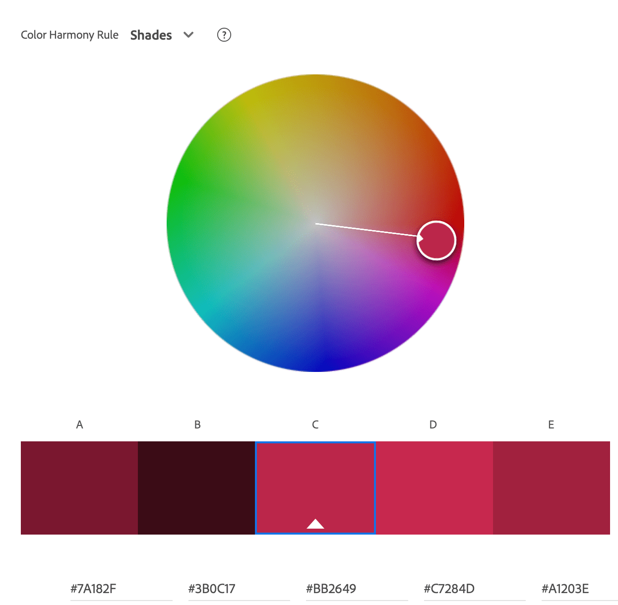
Hex and RGB codes Viva Magenta – Color of the Year 2023
| HEX | #BB2649 |
| sRGB | R187 G38 B73 |
| LAB | 43.60, 61.25, 20.98 |
Correction: This post was originally published using color data screenshot graphic from Pantone’s website which seems to be in error. It’s been updated with data from the Pantone Connect App for Pantone 18-1750. Viva Magenta is BB2649, not BE3455. The two aren’t much different.
Magenta explodes in the late 1800s
Consumerism and hunger for new colors exploded after that (no pun intended as aniline is quite flammable!). New dye-making processes were developed to create more versions and more colors. Painters were always seeking new, bold colors to distinguish themselves from others. The new boldness of magenta was quickly utilized by famous painters such as Gauguin, Matisse, and others. Sadly, magenta’s toxic manufacturing continued as St. Clair notes that high levels of arsenic were found in samples of magenta in the early 20th century. Versions of color became involved in intellectual property lawsuits that persist into modern day.
This doesn’t mean that the 2023 color is toxic, but lays an interesting contextual foundation for the language used in describing it. I’d argue not so rooted in nature, but in industrial experimentation, war, and trying to satisfy a highly competitive public craving for something new. Maybe color manufacturers should work on releasing Sustainable Saffron. Note to self: I should probably trademark that.
It used to be that only Pantone promoted a “color of the year” – but I’ve seen many paints and interior design companies jump on the marketing bandwagon with their own declarations. For 2023, Sherwin-Williams has Redend Point, Krylon with Spanish Moss, Better Homes and Gardens with Canyon Ridge, and Behr being particularly adventurous with Blank Canvas. (way to phone it in Behr ? ) While I’ve always had a bit of cynicism around the marketing hype that comes with the color of the year, the others piling on just kinda cemented it. Despite that, I still find it a fun exercise and topic to post about.

Viva Magenta in Photographs
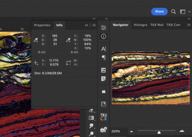
I admit this is a bit of a tough color for me, because if I saw the color without all the language surrounding it, I would basically call it a faded red. The RGB values tell me it actually IS mostly red but not quite. A dash of blue and sprinkling of green.
I typically turn to my Lightroom keyword list when hunting for this type of thing, but my color keywords are fairly basic. My magenta photos tend to lean towards the pinkish purple magenta, and my red photos are more of the deep red variety.
Colors in nature are rarely homogeneous anyway as running a color picker over a photo will tell you. They tend to be gradients and blends of all sorts. Throw in the technicalities of image sensor capture and color spaces and even my eyes gloss over resulting in my selections being along the lines of close enough, which probably makes any color technician cringe. Sorry color nerds, I try.
I only started following Color of the Year because it resulted in a fun scavenger hunt through my photographs to see if I could find close matches. It’s like when your music library gets so big you begin to forget about songs until you create a playlist of all songs that start with the letter “S” or all songs that reference animals.
For 2023’s color, I didn’t come up with a lot. For color snobs, I probably came up with a pretty poor matching lot. That’s ok, it’s the journey that counts right? As long as I approach it with a joyous, brave and rebellious spirit.
Featured Image at top: Stone Scorpionfish, Scorpaena mystes, Wolf Island, Galapagos Archipeligo, Pacific Ocean FI4589


Thanks a lot for the history of magenta! Nice examples with the color appearing in your photos. I looked at that color and thought “ya… nope!” 🙂
Interesting information on the history of magenta. ? It is so difficult for me to separate the different colors. I normally just have the I like or I don’t approach. Each year you cause me to look at that. It could make me a better photographer. And that cryptic teardrop crab image is kool!
so many color differences are so subtle now … even the interpretations shift over time and cultures
Never would have guessed that magenta had such a roundabout and sordid history. Go figure!
Same. A lot of wild stories in the pursuit of different colors, not all with happy endings.